CMU Lockups
Our Action C Combination lockup system combines our signature mark with a CMU unit name to provide a consistent look that strengthens our brand.


Standards
Criteria
Lockups must be used to represent the following CMU areas:
- Academic programs*
- Centers
- Collaboratives
- Colleges**
- CMU locations/facilities
- Departments
- Divisions
- Institutes
- Offices
- Schools
- Service units
- Student support services or programs
*Academic programs may use lockups at the discretion of the college.
**If you are part of an academic college, please contact your college communicator for your lockup.
Clear space and minimum size
Clear space
To maintain legibility and visual impact, our CMU Action C Combination lockup must have clear space around it that is not infringed upon by text or other visual elements. Use of the width of the circle in the lockup as a gauge to determine if the logo has sufficient clear space surrounding it.

Minimum size
To maintain legibility, the Action C Combination lockup should never be reproduced in sizes smaller than .5 inch tall (48 px).


One-color variations
For lockup use on apparel and promotional items, see trademark and licensing.


Incorrect use
Drop shadow color
This lockup is using an incorrect color combination. The drop shadow is the same color as the background, making it invisible to the eye. Please use the mark in one of the approved color variations.

Gold on black or gray
Because gold and black resemble another university's colors, it is not an approved color combination. If you are using a lockup on a black or gray background, please use a two-color mark in maroon with a gold drop shadow. One-color options are available for promotional items upon request.

Tilting or rotating the mark
The mark is drastically angled, making it difficult to read. Marks must be used in their original format and not angled, rotated or tilted in any way.

Using an unapproved color variation
Do not change the color of the mark from one of the approved color variations. One-color variations are available upon request.

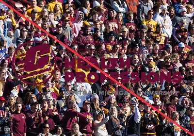
Placing the mark on a busy background
The background image is too complex and does not provide enough contrast, which makes it difficult to see the mark. To ensure readability, marks must be placed on noncompeting backgrounds.
