We Do Tagline

The We Do tagline creates a quick and memorable phrase that reinforces and supports the tone and message of the CMU brand. The We Do tagline mark is recommended for use on recruitment pieces, advertisements and large communications, and must be used with the Action C Combination mark.

Standards

Horizontal color variations

We do tagline example, a maroon Action C with gold drop shadow lines is located on the left of the words “Central Michigan University

We do tagline example, a gold Action C with white drop shadow lines is located on the left of the words “Central Michigan University

We do tagline example, a maroon Action C with white drop shadow lines is located on the left of the words “Central Michigan University

Vertical color variations

We do tagline vertical example, a maroon Action C with gold drop shadow lines are located above the words “Central Michigan University

We do tagline vertical example, a gold Action C with white drop shadow lines are located above the words “Central Michigan University

We do tagline vertical example, a maroon Action C with white drop shadow lines are located above the words “Central Michigan University


Incorrect use

Drop shadow color

This mark is using an incorrect color combination. The drop shadow is the same color as the background, making it invisible to the eye. Please use the mark in one of the approved color variations.

Action C Combination mark incorrect use example, a maroon Action C with white drop shadow is directly above of the words “Central Michigan University

Gold on black or gray

Because gold and black resemble another university's colors, it is not an approved color combination. If you are using a lockup on a black or gray background, please use a two-color mark in maroon with a gold drop shadow. One-color options are available for promotional items upon request.

Action C Combination mark incorrect use example, a gold Action C with white drop shadow is directly above the words “Central Michigan University

Tilting or rotating the mark

The mark is drastically angled, making it difficult to read. Marks must be used in their original format and not angled, rotated or tilted in any way.

CMU Action C Combination mark incorrect use example, the logo is tilted on an angle, a maroon Action C with gold drop shadow is directly above of the words “Central Michigan University

Using an unapproved color variation

Do not change the color of the mark from one of the approved color variations.

CMU Action C Combination mark incorrect use example, an Action C located directly above of the words “Central Michigan University

Modifying the mark

This mark is missing the lower portion. The mark must be used in its entirety and not altered in any way.

CMU Action C Combination mark incorrect use example, a maroon Action C with a gold drop shadow framed within a maroon circle against a white background.

Placing the mark on a busy background

The background image is too complex and does not provide enough contrast, which makes it difficult to see the mark. To ensure readability, marks must be placed on noncompeting backgrounds.
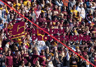
Action C Combination mark incorrect use example, a maroon Action C with gold drop shadow above the words “Central Michigan University